Part 1. The building blocks (dot, line, shape, and texture)
Part 2. Movement (motion and direction) and Perspective (scale and dimension)
Part 3 (today's post). Colour (hue, value, and saturation)
Colour has become a dominant design principle in illustrated books for children over the last several decades. Classics, such as Johnson's Harold books and McCloskey's Make Way For Ducklings or Blueberries for Sal, however, are evidence that illustration can be divine on a monochromatic scale.

From Blueberries for Sal (1948)
Other books, such as Richard McGuire's Orange Book (1992), which uses only the complementary colours of orange and blue, or Cathy Stinson's Red is Best (1982), which emphasizes the narrator's preferred colour, or the wordless picture book Yellow Umbrella (2001) by Jae Soo Liu deal in the essence of hue.
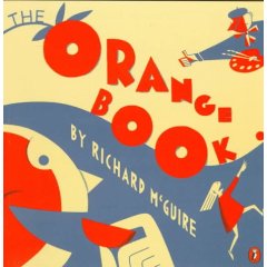
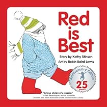
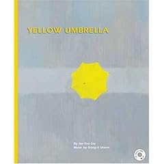
Hue is plucked straight from the colour wheel and comes in the infinite combinations of those three primary colours: red, blue and yellow.
 Bob Staake's The Red Lemon (2006)
 from Fish Eyes: A Book You Can Count On by Lois Ehlert (1990)
A picture can comprise mainly warm hues:
 a cross-section of the old white cabin in Delicious by Helen Cooper (2007)
Or cool hues:
 From Rob Gonsalves' Imagine a Place (2008)
 Sometimes the lifeblood of the image is a pocket of warm colour lying in a sea or sky of cool:
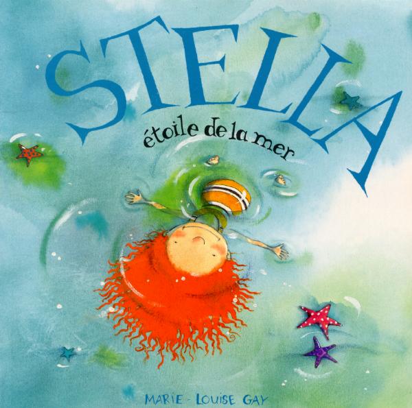 Marie-Louise Gay's Stella: Star of the Sea (English language version) (1999)
 Christopher Myers' Wings (2000)
Value refers to the amount of light or dark in an image and the interplay between them.

From Peggy Rathmann's The Day the Babies Crawled Away (2003)
 From Creation by Gerald McDermott (2003)
Whereas Beatrix Potter uses value to show the warmth of the hearth in winter,

Chris Van Allsburg plays with value to eerie effect in The Mysteries of Harris Burdick (1984), a suggestive, imaginative picture book for elementary aged children.

 Ted Harrison's depiction of the Aurora Borealis feels like stained glass, so filled with light are his colours. From O Canada (1992).
Saturation deals with the amount of grey that influences a colour.
 In Janell Canon's Stellaluna (1993), the contrast of the bats who lack colour saturation with the highly saturated night sky provide maximum visual impact. The resulting ultra-realism emphasizes the vulnerability of the bats, creatures that the reader may not normally sympathize with.
In Knuffle Bunny (2004), Mo Willems splashes highlights of mid-saturated colours over top of black and white photo stills of a Brooklyn neighborhood to add a family atmosphere to the city backdrop. His illustrations often look like animation stills.
The use of water colours produces a canvas of lightly saturated colours.
 In many books, and Barbara McClintock's Dahlia (2002) is a fine example here, such illustrations have a rural or old-fashioned feel to them, no doubt because they hearken back to the 19th and early 20th styles of early masters in the genre:
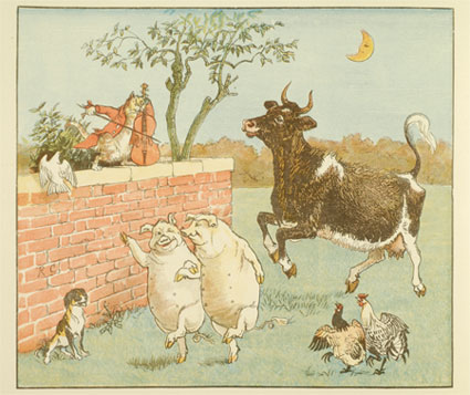 Randolph Caldecott
 Kate Greenaway
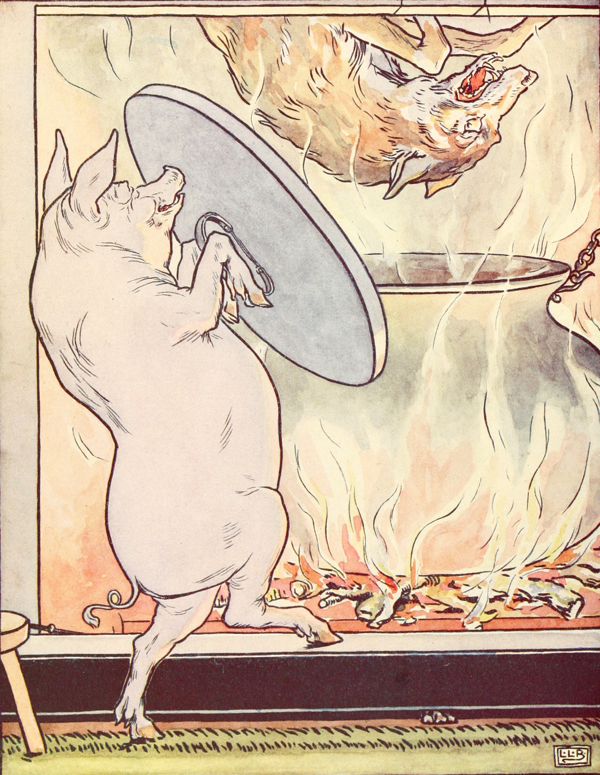 Leslie Brooke
and Beatrix Potter
And then there is Norton Juster's Hello, Goodbye Window, illustrated by Chris Raschka, that conjures up a rustic nostalgia by using mid-saturated, high value colours.


If you want to see what Rashka has to say about his approach to illustrating this book, read the engaging caption he put on one of his pictures that was reproduced for the New York Times.
Raschka uses a similar style for a cover of the Horn Book Magazine.

Highly saturated colours often, but not always, suggest an urban or contemporary setting, partly because contemporary printing technology allows for the mass reproduction of rich colours.
 Vera B. Williams' A Chair for My Mother (1982).
Then there's the tropical feel of Dayal Kaur Khalsa' My Family Vacation (1988):

Highly saturated colours also feature prominently in many folk tales. Different colour combinations can be suggestive of different cultures or ethnicities:
 Leo and Diane Dillon's Why Mosquitoes Buzz in People's Ears: A West African Tale (1975)
 Ricardo Keens-Douglas' The Nutmeg Princess; illustrated by Annouchka Galouchko (1992) (a folk tale from Grenada)
 Gerald McDermott's Raven: A Trickster Tale From the Pacific Northwest (1993).
______________________________________
In regaling you with examples of how the 11 design principles work in picture books, it was my hope that you would see how smart illustrations, when combined with visual literacy skills on the part of the reader, can contribute to the overall experience of reading a book. Do I kid myself that my daughter sees all this when she is looking at books?
No. Not for a second. But she does see a lot of things in illustrations that I don't catch right off. We also spend a lot of time talking about the pictures in her books in an effort to tease out both our ways of seeing. Books that are flatly illustrated don't allow us to open up the conversation. They don't influence our mood or emotions as we are reading. The really good books do, though, and each time I come back to those books to figure out why, the answer is usually right there in front of me in their finely crafted illustrations.
__________________
The images in this post have been used as part of a work of criticism and under the clause of "fair dealing" in the Canadian Canadian Copyright Act. I have not used more than 10% of any given work.
Oh, my goodness is this ever wonderful. I adore the image in the Peggy Rathmann book.
ReplyDeleteI will be the first to admit that I am a layman insofar as children's picture books go, but I've always loved Marla Frazee's illustrations (see, for example, The Seven Silly Eaters).
And I would guess that Frazee fits in with the rural or old-fashioned group.
ReplyDeleteLovely!
ReplyDeleteMy husband is ALWAYS talking about the art in kids' books - we have different favorites. I tend to like more muted, subdued illustrations and he likes vivid, saturated, cartoonish pictures. All three of our kids are hyper-aware of the art in their books, too.
this post was so informative. i always had a "feel" for how illustrations differ in children's books (yo, yes vs peter rabbit, for example), but never knew the technical terms for it all. thanks for this great post.
ReplyDeleteWow - a whole new list of books. I'll have to look for these in our library, and if they're not there, get the librarian to order them!
ReplyDeleteWhen I was learning to read all mothers in pictures books were caucasian and resembled the women in "Blueberries for Sal". Diversity had not yet been invented.
ReplyDelete(your) Anon
You've got a beautiful set of illustrations here; love it.
ReplyDeleteI was lucky enough to get to the Beatrix Potter museum and see some of the originals. What amazed me a lot was how small they are, yet they blow up to posters in perfect detail.
The woman was a genius. I loved her stuff when I was small. But my kids prefered primary colour, high content illustrations.
beep beep boop plalalala
ReplyDeleteNice books(:
ReplyDelete