The building blocks (dot, line, shape, and texture) (the subject of my last post in this series)
Movement (motion and direction)
Perspective (scale and dimension) and
Colour (hue, value, and saturation)
The rest of today's post will look at movement and perspective. The final post in the series will focus on colour.
From utter stillness, motion emerges:

Rob Gonsalves holds stillness and motion in tandem in this surreal illustration featured in Imagine a Night (2003). His paintings have been pulled together in three separate picture books, Imagine a Night, Imagine a Day, and Imagine a Place, all with text provided by Sarah L. Thomson. The text doesn't shine so well as the illustrations but the books are stunning eye candy for all ages.
Picture book artists create motion on a fixed, 2-dimensional plane by using using multiple techniques, and, unlike the Gonsalves illustration would you have you believe, the motion created is most often pure silly fun.
 David Shannon's title character from No David! (1998) makes a mad dash from his bath. The oversized sidewalk seems to spit him out, limbs extended and body soaring skyward.
Barry Moser's rabbit leaps above the title of this book: Jump!: The Adventures of Brer Rabbit by Joel Chandler Harris, Van Dyke Parks, Malcolm Jones (1986). The torn blue backdrop that is slightly akimbo reinforces the motion suggested by the image.

Moser again on the cover of Margie Palanti's Earthquack! (2002). Even the letters in the title are subject to seismic upheaval.

Lane Smith's retro, space-age tumble into the abyss on the cover of Scieszka's Math Curse (1995).
And now, a few motion-centric illustrations that bring me joy:
 Candace Fleming's Smile Lily, 2004
 Helen Cooper's continuation of the Pumpkin Soup story, Delicious, 2007.
 Me and My Sister, Ruth Ohi, 2005.
 Linda Bailey's Stanley's Party illustrated by Bill Slavin, 2003.
While motion suggests movement on the page, direction prompts the movement of your eye over the page.
 In this illustration from Barbara Reid's Sing a Song of Mother Goose (1987), Jack and Jill are pure motion; their tumble down the hill, though, directs the reader's eye straight to the page turn, for one does not linger in the verbally tripping land of the nursery rhyme.
 Harold's policeman also points to the page turn with his arm and his eyes. (Harold and the Purple Crayon by Crockett Johnson, 1955) In the illustration from No David! above, the sidewalk forces our eyes to follow David's streak to freedom.
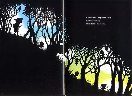
Peggy Rathmann's heroic quest, The Day the Babies Crawled Away (2003), features a driving, rhyming cadence that is accompanied by illustrations that move the reader's eye from top corner left to bottom corner right. As such, the story tumbles along until the pattern stops abruptly when our hero and his infant charges get trapped at the bottom of a cliff. At this point in the story, the black frame of the page surrounds them on three sides, effectively holding them captive.
 Anthony Browne's Willy is a nose-in-the book sort of fellow. No so, his friend Hugh, who attracts the annoyed stares of the other library patrons. The entire meaning of this illustration from Willy and Hugh (1991) is told by following the direction of the eyes.
 And finally, here's one more marriage of motion (the font, the girl with arms uplifted) and direction (the buildings) acting in harmony. Robert Neubecker's Wow! City! (2004)
Perspective
Next, we come to perspective and the two visual techniques that help to determine it: dimension and scale.
Dimension refers to the level at which a reader's eye encounters an image. Are we viewing the scene from on high? Are we looking up from the ground? Or are we meeting the image at eye level?
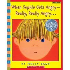 Molly Bang's When Sophie Gets Angry--Really, Really Angry (1999), shows the child reader what a temper tantrum looks like from a child's eye view.
 When Sophie explodes, the dimension is eye level. When Sophie runs away and feels very small, the reader sees her as a speck on the landscape. By carefully manipulating dimension, the artist aligns the reader's sympathies with her character. Throughout the book we identify with Sophie and can therefore better empathize with her situation.
Now you tell me, in this illustration from David Wiesner's Tuesday (1991) are we meant to identify with the people who inhabit the town or the town's mysterious night time visitors?

Scale is similar to dimension but it is intrinsic to the picture itself rather than relying on the reader as viewer. Scale can simply let us know the size of one object relative to another as is the case in this picture from Wiesner's June 29, 1999:
 And scale can sometimes make you smile:
 From David Shannon's Duck on a Bike (2002)
Alternatively, scale can convey the emotional crux of a situation. Take for example the day Willy the Wimp accidentally bumps into Hugh:
 From Anthony Browne's Willy and Hugh (1991)
________________________________
The remainder of this series can be found here:
Part 1. The building blocks (dot, line, shape, and texture)
Part 3. Colour (hue, value, and saturation)
________________________________
The images in this post have been used as part of a work of criticism and under the clause of "fair dealing" in the Canadian Canadian Copyright Act. I have not used more than 10% of any given work.
No comments:
Post a Comment
Note: Only a member of this blog may post a comment.