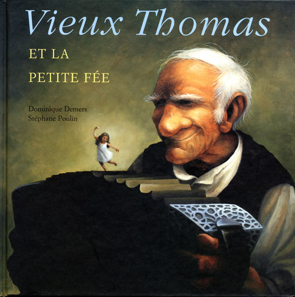
I've got my tickets. Last Saturday, as a tie-in to the upcoming performance, the Fredericton Public Library hosted a reading of the picture book. The audience mainly comprised the 5 and under set while parents and grandparents sat in the seating at the back. Loralie Boyle from the children's department led the children through a series of actions wherein they mimicked the ocean and various creatures within it. She then read the book accompanied by Alex Bailey on guitar. The combination of words and music was mesmerizing. Yet, how could any reading of this book not draw the listener in? The themes of life and death, love and loss, and anger and redemption flicker behind this deceptively simple tale about an old man who nurses a fragile, ailing fairy back to health.
This book got me to thinking about the sub-genre of children's books that carry a strong undertow of maturity and meaning, books that many would argue are not children's books at all--except for the astonishing fact that many children love them deeply and come back to them time and again.
In our house, three such books have become obsessive favourites:

Margaret Wise Brown's The Important Book is nothing more than a series of highly descriptive prose poems. It begins with a simple object:
"The important thing
about a spoon is
that it you eat with it."
Each page then describes a different object or phenomenon--an apple, snow, wind, a shoe--in an effort to crystallize its essence. The illustrations by Leonard Weisgard are simple and suggestive. They politely step back and allow the cadence and visual images provided by the words to explode inside the mind of the young reader.
The last page of the book moves into the metaphysical:
"The important thing about you is
that you are you.
It is true that you were a baby,
and you grew,
and now you are a child,
and will grow,
into a man
or into a woman.
But the important thing about you
is that
you are you."
Rather than a straightforward illustration of a child on the page, the accompanying illustration simply shows the words "you are you" written in script--for part of what makes you you is the ability to frame the abstract world around you, as you grow, through language.
Jan Andrews' Pumpkin Time is an odd book. The illustrations by Kim LaFave create an expectation for light, seasonal whimsy. Instead, this picture book is, I think, an extended metaphor for maternal depression. When three children wake one morning to discover their mother has transformed into a pumpkin, they take the situation in stride. They go about their lives hiding their new reality from the world and making do as best they can. Their strength and independence call forth a sweet music from the pumpkin. But the burden of caring for themselves and the loneliness of being without their mother begins to wear on them. At the point where they become overwhelmed by their new lot, the children wake up to have their mother restored.
The first time I read Pumpkin Time to my daughter, I had no idea what it was going to be about. As I read along, I anticipated anxiety, fear or even boredom on her behalf. Instead, she was completely drawn into the story and has insisted on having it read over and over again for weeks on end. I think it helps her work through her fearful fours and the new awareness of how independence can and is tied up with abandonment issues. (As a companion book to Pumpkin Time, re the theme of maternal depression, check out Liz Rosenberg's Monster Mama. It is less ethereal and is decidedly cheeky.)
The most beloved book in our collection is, without a doubt, Arnold Lobel's Uncle Elephant.
 This easy reader by the author of the Frog and Toad books is a masterpiece of literary minimalism. When the young narrator's parents get lost at sea, he is taken in by his aged Uncle. The book playfully explores youth vs age and naivety vs wisdom. It is a testament to grief and a quiet tribute to the love that can grow from mutual loss. The nonesensical elephant song that serves as the emotional climax of the book makes both me and my daughter very happy.
Now, tell me, what are the books in your collection that show a more complex world beyond the veil? Do you enjoy reading them? Alone? With children? What is the response of the children you read them to?

 Bob Staake's
  from
from 
 From Rob Gonsalves'
 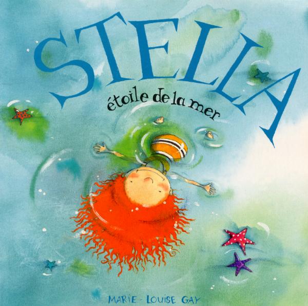 Marie-Louise Gay's
  Christopher Myers'
 From
From 


 In Janell Canon's

 Randolph Caldecott
 Kate Greenaway
 Leslie Brooke


 Vera B. Williams'
 Leo and Diane Dillon's
  Ricardo Keens-Douglas'
  Gerald McDermott's
 David Shannon's title character from


 Candace Fleming's
  Helen Cooper's continuation of the
 Linda Bailey's
 In this illustration from Barbara Reid's
  Harold's policeman also points to the page turn with his arm and his eyes. (
 Anthony Browne's Willy is a nose-in-the book sort of fellow. No so, his friend Hugh, who attracts the annoyed stares of the other library patrons. The entire meaning of this illustration from
  And finally, here's one more marriage of motion (the font, the girl with arms uplifted) and direction (the buildings) acting in harmony. Robert Neubecker's
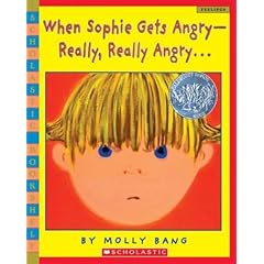 Molly Bang's
  When Sophie explodes, the dimension is eye level. When Sophie runs away and feels very small, the reader sees her as a speck on the landscape. By carefully manipulating dimension, the artist aligns the reader's sympathies with her character. Throughout the book we identify with Sophie and can therefore better empathize with her situation.
 And scale can sometimes make you smile:
 From David Shannon's
  From Anthony Browne's